Wednesday, October 26, 2011

We are more alike than you think

(click image to enlarge)


Recent incidents I've witnessed have prompted me to create this poster:

A puppy,
who was kept in a cage for most of the day, hardly petted or played with.

A rabbit,
who died when its owners went off for a holiday, and its body rotted and was left for some days even after they returned.

Two kittens,
one died and the other left dying after a car backed over it and drove off. Another car came and, ignoring the tiny body still heaving for breath in the middle of the road, ran over it again.

And although some religion believe that animals do not have souls, they still feel pain and fear. Can we claim to be more evolved beings if we do not show a bit of humanity?

Tuesday, October 4, 2011

Tacky is Sticky

I was lamenting to a friend of mine that recent advertising taglines were rather tacky, to which she commented, "Tacky is sticky".

How true! For example, the "Happy birthday cake to you" line by one particular ice cream retailer is strange, but sticks firmly in my head.

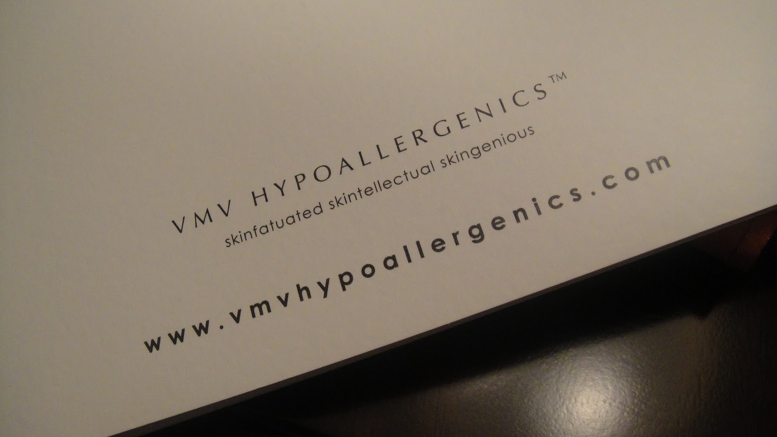
I spotted another example in Manila by one of its local skincare brands, combining the word 'skin' with other relevant words that start with the last letters of the former: SKindulge, SKintellectual, Skinfatuated and, my favourite, SKingenious.


Slightly over the top, but utterly memorable!

Wednesday, September 14, 2011

MBO Promotions

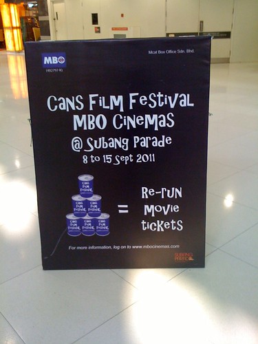
MBO had been actively promoting their upcoming cineplex (now opened) at Subang Parade through clever boards throughout the mall.

I thought this was delightful:


Cans, Cannes; Cans Film Festival, Cannes Film Festival...Get it?

Of course this wasn't very clear. Not many would have gone online to understand better, like I did. 

But when I did, I thought it was quite clever:
(image: mbocinemas.com)

A charity event to collect can food in exchange for re-run movie tickets! Clever pun, good intentions!


Tuesday, August 16, 2011

Beautiful Ugly

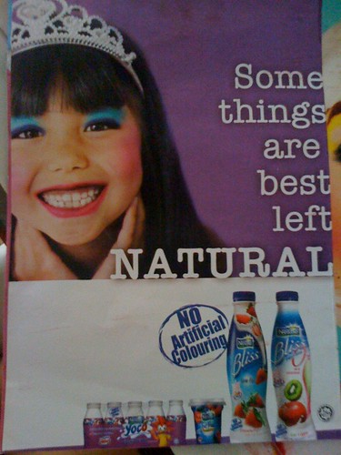
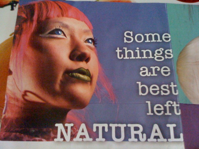
As oppose to Dove's campaign of featuring naturalness to promote naturalness,  I love Nestle Yoghurt Drink's approach of showing what's unnatural instead.

They manage to feature beautiful unnaturalness which still gets the message across, without 'uglifying' their marketing campaign images 
(think of the pictures on cigarette boxes that are repulsive yet remain an ineffective campaign to deter smoking).


Monday, August 15, 2011

Sex(ual Innuendos) Sell, Genius vs Obvious

Billboard spotted off Federal Highway

I have to agree with Donald Trump that sex sells. It's not the only thing that sells, but probably the easiest to portray and improvise.

This billboard caught my attention with it's catchy tagline and not so subtle sexual innuendo. Although I wonder whether most Malaysians understand the term 'pop your cherry' (which means, to lose your virginity).

Which brings me to the lesson I've learnt over the years regarding marketing communications that are very clever but might not be understood by the general population versus something simple that is easily comprehended by most. Many a times, I've been tempted to go with the former, thinking that such a genius of an idea that I've come up with must not be wasted. But I've realised that there's no point being a genius when no one can recognise your ingenuity (unless you're really an artiste who lives and breathes beauty, surviving on water and air....alas, I'm a commercial copywriter and marketeer who doesn't want to know hunger).

A friend suggested that a better alternative would be "Pimp your berry yet?", using the slang that is popular among the younger people, who are the target audience of such a product. It would still be fun, contemporary and, most importantly, easily understood and identified by the target customers.

Tuesday, August 2, 2011

Niche Marketing: Targeting the local Chinese market

Until we achieve a truly single minded rakyat, we have to admit that the different races in Malaysia have tastes, styles and preferences based on cultural influences dating back to our ancestors from Palembang, China, India or aboriginal traditions in Borneo.

Hence there is still a need for niche marketing in Malaysia based on race and individual mother tongues.

I recently worked on a project that required such an approach, specifically targeting the Chinese market. When working on such a project, one must make a conscious effort to avoid approaches that can be labelled 'chinaman style' by the public, which led me to explore projects that have successfully achieved a contemporary style yet maintain an oriental flavour:


The Empire Shopping Gallery in Subang Jaya uses a neutral word - Empire - that could apply to any western or eastern empire. 

But it uses its logo to skew perception towards east - 
a chinese coin outline, with the middle pattern being the word 'wang' or 王 that means 'emperor'.

Subang Jaya is a middle upper class neighbourhood with a majority of Chinese residents. Which brings me to the next development also in Subang Jaya:


Da:Men is a mixed residential development in USJ. It translates into 'Grand Entrance' which immediately brings to mind an old chinese mansion owned only by the wealthy. It's a novel way of presenting the well used idea of luxury and comfort.

The logo simply uses the chinese characters, to good effect. Chinese characters are essentially pictograms that depict its subject visually. The character on the right, men, 門, resembles a door. This logo was blown up fully spanning the height of the hoarding surrounding the construction. Whether intentionally or happy coincidence, it looks like big doors on the hoarding, inviting passers-by to walk through them.


I end this entry with a bit of digression. Though I mostly work on English medium projects, the Chinese language has always fascinated me. For instance, the character for wood is mu, 木. To depict a forest, the mu character is simply repeated to represent many trees - sen, 森. 

It also takes less chinese words to present an idea as compared to the English or Malay language. For example, take the simple phrase of "Please be careful" (4 syllables) or "Sila berhati-hati" (7 syllables) as oppose to "Qing Xiao Xin" (3 syllables). Come to think of it, a copywriter for chinese content might be shortchanged if they charge by word basis! 

Tuesday, July 26, 2011

A 'Huh?' Moment: How copywriting should not be


"Being in your birthday suit can often cause social embarrassment and a proclivity for honey, but at least one of these challenges can be addressed in style. Save the birthday suit and be seen sporting a stylish apparel with Celio......"

Whoever wrote this was probably trying to be clever. Subtle sexual implications (in this case, nudity) is often an easy and effective way of attracting attention.

However, when I received this promo in my inbox, I spent a good few minutes trying to figure out this introduction. It seems that the copy is trying to sell T-shirts by stressing that one should not be naked...an idea that do not make much sense to me. Furthermore, is being naked such a challenge in a country where cotton and artificial textile is abundant?

"Proclivity for honey"?  Is it trying to say that going naked will get you more sex? Heck, which guy wouldn't want that? Half the guys I know would gladly go naked for more 'honey'. This line is just trying too hard in vain.

Which brings me to cliche tips when it comes to copywriting: Keep it simple if you can't make it 'complicated nice' and Less is indeed More. Good writing is not about using difficult or sophisticated language that the masses have difficulty understanding, especially when it comes to selling mass and quick selling products. It's more important to choose content that evokes an urgent need to purchase, and present them clearly. To make them, as one friend says, "Buy First, Think Later"